
While I’ve been doing a lot of “black and white” drawing lately — graphite, charcoal, conte — I’ve also been playing around with my watercolors more than ever before. Instead of just dabbling — and dribbling — I’m taking a little time to learn more about the art of watercolor, and as a result, I’m enjoying it more than ever.
I don’t profess to be good at it, but I’m getting better. I like the way some of my skies are turning out, and no matter what the results look like, it’s always fun to play with colors.
When I first attempted watercolor a few months ago, I naively thought that red was red, yellow was yellow, and…you know how the rest of my thoughts went, I’m sure. On the plus side, I did have a grasp on basic color theory.
Very basic, I now know. Goodness, gracious, but there’s a lot more to it than I’d ever thought possible!
My previous knowledge consisted of simple facts. Primary colors. Right. Red and yellow make orange. Right. Blue and orange are complementary. Right. And, oh, how I prided myself for knowing that lighter hues are tints, and darker ones are shades.
Of course, what I didn’t know was how much I didn’t know, you know?
 I once thought the color wheel was simple. I didn’t know there was more than one. I used to think reds and oranges were warm, purples and blues were cool, and I was never quite sure what to do with that ambiguous green.
Now I’ve discovered that artists can choose warm blues or cool reds. I’ve learned, too, the proper protocol of always putting the primary color first when naming a mix. In the past, I had no compunctions about calling a color violet blue.
I won’t make that mistake again, trust me.
I did know a few basic color schemes. I’ve been introduced to so many now I’m wondering how anyone keeps them straight.
Color theory, I’ve learned, isn’t a simple subject. Entire books have been written about it, a fact that amazed me when I started browsing for information. I’ve even downloaded a few from Amazon. Some are good, some are better, and some aren’t worth the download.
Where I’m having the most fun, however, is in learning about the different pigments and the hues they produce. Yellow isn’t simply yellow. It could be Cadmium Yellow — Light, Deep, or Medium — Arylide Yellow, or Aureolin. And that’s just for starters.
A very helpful site I’ve found is Pigments and Paints: What You Make Art With.
In the past, if I read “alizarin crimson”, my thought was “well, any red will do, won’t it?” Did having specific pigments make a difference? Really? I’m probably making a few watercolorists cringe at my thinking, or at least have a good laugh over it.
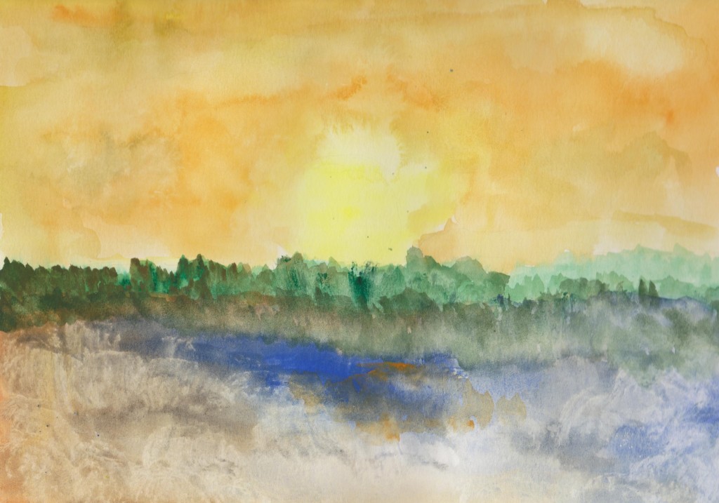
If you were to ask me what colors I used in my little “Yellow Dawn” painting above, I couldn’t tell you. It was created before I really understood that colors are more than colors. I used yellow and orange. I used green and blue. I just had fun playing.
As I’m learning and beginning to understand how very different one blue can be from another, I’m compiling lists of the watercolors I have. I’ve discovered three “lemon yellows” among my watercolors — one by Sakura in my “Koi” field kit, another from Staedtler, and yet another tube in my original Daler-Rowney set — the first watercolor set I bought. How much do they vary from one manufacturer to another? That’s something I plan to research “hands-on”.
It’s fun to know more about the colors I’m using. Although the information seems almost overwhelming right now, I think with more experience, I’ll gradually come to know the colors and their properties. I’ll probably find a few favorites.
I’m learning, too, to create my own specific palettes, such as four colors to use for skies, or choosing specific pigments of “red, yellow, brown, and white” in order to “get the skin tones right.”
You know what I like best, though? I love saying the names of these paints. I feel like a true artist as I whisper “Payne’s Grey”, “Cerulean Blue” or “Viridian Hue”.
Now, I’m off to do a little painting. How shall I color my world today?

Oh that sounds like me! Probably sounds like everyone before they started working with color. I couldn’t figure out why deep cad red plus cobalt blue didn’t give me the pretty purple I wanted….well, cuz there is a hint of yellow in the red…so have to go to something like permanent rose or alizarin and cobalt or even better, french ultramarine…then I learned about rogue colors like alizarin crimson and quit using it so much and cool yellows vs warm yellows and oh my! On and on and on! I will be learning forever.
I am very curious about gauche. Have you tried that?
LikeLiked by 1 person
I have a set of opaque watercolors but I haven’t used them much.I’ve played around with them, but that’s all so far.
LikeLike
If you ever try, you must report.
LikeLiked by 1 person
I might get them out again and do a little comparison between them and my transparent watercolors.
LikeLiked by 1 person
Very beautiful.
LikeLiked by 1 person
Thank you.
LikeLiked by 1 person
I need to be better about my color usage too. So much more to it right??
LikeLiked by 1 person
It’s fascinating. So much to think about when painting!
LikeLiked by 1 person
I used to use gouache watercolours and then went on to oils, they have the same names, you’re making me miss my painting days 😊
LikeLiked by 1 person
I sometimes feel overwhelmed by all the information about colors. I know I’ll never learn it all, but I hope I learn enough to enable me to make wise choices.
LikeLiked by 1 person
What did you think of gouache?
LikeLiked by 2 people
Loved them,kind of like a cross between oils and watercolours, great for both texture and finesse, I felt a great element of control when using them.
LikeLiked by 2 people
They look interesting to me.
LikeLiked by 2 people
Oh, and let’s not talk about all the theories on color floating about….Color is fascinating…..if you ever want to see what you can do with just two colors, try Fr. Ultra. Blue and Burnt Sienna, my two colors to really have fun with. You can get a huge myriad of mixes. I am a color fanatic and I am too enticed by it. I took up knitting about 5 years ago for about a solid year. I discovered why I even cared to knit, it was all those colors and combinations of color! I would go in and buy yarn just because of COLOR! Anyway, that is all I have to say on that subject for now. lol 🙂
LikeLiked by 2 people
LOL…color is so exciting. When I first got my set of Prismacolor Premier pencils, I nearly fainted from the sight of so many beautiful colors. That was the moment when I said, “I’ve got to learn to draw.”
LikeLiked by 2 people
ha! you are a color lover as well! 🙂
LikeLiked by 1 person
Most definitely!
LikeLiked by 1 person
Color is fantastic. I’m addicted to it.
LikeLiked by 1 person
Color is so much fun and there is so much to learn, for all of us! Looking forward to watching your progress!
LikeLiked by 1 person
Thanks, Laura. I appreciate all your encouragement and advice.
LikeLiked by 1 person
I may not still be painting and drawing without receiving so much of both myself! Happy to pass it along, no problem.
LikeLiked by 1 person
It’s greatly appreciated!
LikeLiked by 1 person
I dug out one of my watercolor books this morning and read it during the drive to visit my husband’s parents. Well, I didn’t read the whole book. What I mean is I read parts of it, and it’s got a lot of great information about pigments and the properties of paints. It’s going to be really helpful as I figure out which colors I want to start building my “good” palette with.
LikeLiked by 1 person
Isn’t it fun to constantly learn something new? I feel like I learn something new about art in general everyday too!
LikeLiked by 1 person
There’s so much to learn about paints and pigments! It’s fascinating but almost overwhelming.
LikeLike