
We all have favorite colors, don’t we? Maybe it’s not a single color but an overall color “family”, or maybe we like only certain tints or shades of a particular hue. Most of us, I think, have a decided preference between warm and cool colors.
I’m a cool color lover. Give me blues from the lightest to the darkest, and go ahead, add in a few touches of green and violet. Surround it with lots of white space, and you’ve got a perfect color combination. In my opinion, that is. Your opinion of perfect colors is probably different.
Recently Dawn from Brush of Dawn Oil Paintings shared a link to an “Artistic Preference” quiz. One of the assessments was for a warm/cool color preference. It’s a fun little test to take, although I don’t know how accurate the overall results are. I will say, however, that my preference for the cooler side of the spectrum did come through.
The test information indicated that women generally prefer warmer colors while the cooler colors are considered more masculine. I think that’s a concept that has become ingrained in our western culture. We dress little girls in pink and baby boys in blue, although that’s actually a fairly recent idea.
For centuries, children of both genders wore practical white dresses. These could easily be pulled up for changing diapers, and the dresses could withstand lots of bleaching. When pastel colors were introduced for children, they weren’t gender-specific at first. Gradually, though, accepted conventions were established — precisely the opposite of what we now think of as “correct.”
“The generally accepted rule is pink for the boys, and blue for the girls. The reason is that pink, being a more decided and stronger color, is more suitable for the boy, while blue, which is more delicate and dainty, is prettier for the girl.” – From Ladies Home Journal, June 1918
Fashion thinking has gone in different directions since then. In the 1940’s we began seeing blue for boys and pink for girls — the latter an idea reinforced in the 1950s with the introduction of Barbie dolls dressed in pink. Then, as “Women’s Liberation” came along in the late 60’s and early 70’s, there was a trend toward “unisex” colors. Things changed again when advances in medical technology made it possible for women to know their unborn child’s gender, and having a distinct “pink for girls” and “blue for boys” was an idea promoted by manufacturers and marketers to sell nursery décor and infant clothing.
I’m sharing this history because I’m wondering if it accounts for the ideas expressed in the art quiz mentioned above. Is it true that women prefer warmer colors? I don’t think that’s necessarily so.
Of course, we do associate warm and cool colors with specific ideas. They are part of a symbolic language we draw upon in our art. They also have certain physical properties which determine how they are best used.
- Warm colors advance and should be prominent in the foreground.
- Cool colors recede and are best placed in the background.
Now that I’ve been reading books on color theory, learning about paints and pigments, and trying first-hand to mix colors on my palette, I know that it’s not as simple and straight-forward as “red is warm, and blue is cool.”
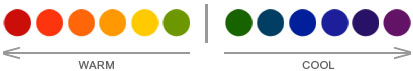
For the moment, though, let’s keep it simple. Let’s go back to the color chart I posted above:
What do these different temperatures represent in art? When we go beyond the “advance/recede” guidelines, what do we express by the colors we choose in painting?
I’ve been exploring this idea while reading Debora Stewart’s book, Abstract Art Painting: Expressions in Mixed Media. One exercise involves expressing emotions. Color, of course, plays a huge part in that.
We tend to associate red with anger, blue with sadness. But then again, we see pink — a lighter tint of red — as delicate and feminine, and we speak of the “bluebird of happiness”, so maybe the associations we think we know aren’t as universal as we might believe.
Recently in a bit of chat with Dawn, she mentioned the cultural belief that blue doors kept evil spirits away. Really? I was off to do a bit of research to learn more. I came across a site on Feng-Shui explaining that blue represents water and abundance. It can represent the sky, as well. It’s seen as calming, tranquil, and peaceful. Blue signifies trust, loyalty, and stability.
Red is associated primarily with heat and fire. Logical, of course. From there it extends to energy, anger, passion, and love. A red door? Back to a little Feng-Shui information. Red means “Welcome”. Red doors can also be “protective” as they symbolize the Biblical story of blood smeared upon the doorways to turn away the plagues of Egypt, or the blood of Christ. And in an interesting note, home-owners in Scotland often painted their front door red to show that the mortgage had been paid in full.
As I’ve been reading and researching, I’ve found the following associations for the colors.
Red
Excitement, warmth, energy, passion, love, desire, speed, motion, strength, courage, power, heat, aggression, danger, fire, flames, protection, welcome, pain, blood, war, revolution, violence, danger, all things intense and passionate, sincerity, happiness.
Blue
Peace, tranquility, balance, cold, calm, stability, harmony, contemplation, unity, trust, truth, confidence, conservatism, security, cleanliness, order, loyalty, sky, water, reflection, solitude, loyalty, technology, depression, sadness, appetite suppressant, happiness.
Do these colors have these meanings for you? Do you use them in your art to reflect these qualities and emotions? Do you have other associations to add to the list?
I’d love to hear your thoughts on these colors. So tell me, are you “hot” or “cold”?

Such great information! Thank you for doing the studying and sharing highlights with us Judith!! 😉👍. When I look at your little color chart I feel more attracted to the warm colors. They just feel happy to me. I have never ever been able to pick a favorite color however. I guess i think too much about it. Lol. I’ve always admired people who can definitively state their favorite color ( or anything for that matter – food?). I love so many things I cannot choose. 😝
LikeLiked by 1 person
LOL. I can always name a favorite, but it’s usually a “favorite at this moment”… it changes often. With colors, though, I’ve always liked blue and the cooler hues.
LikeLiked by 1 person
I don’t know what I am!!!! I think I like a good combination of both. I run hot and cold….but I want them dark and saturated. Sometimes, I think it depends on my mood. I never ever wear yellow, but I paint lots with that color.
LikeLiked by 1 person
Colors are really interesting, especially their symbolic meanings.
LikeLiked by 1 person
They are! I knew about the red as it related to the passing over, but not mortgages. Makes total sense though. Debt paid. Very interesting! Also interesting to me is the different yellow and what they mean…lively and full of vigor…or sick and cowardly depending on the tone.
LikeLiked by 1 person
I think it will be fun to explore different colors, so I’ll probably be posting more about them. It’s fun to read and research the colors. Are you familiar with the Luscher Color Test?
LikeLiked by 1 person
Very fun! I just read about the Luscher Color Test and took a quiz! Thanks for mentioning it.
LikeLiked by 1 person
I’ve always found it surprisingly accurate. What did you think of the results?
LikeLiked by 1 person
I took the quiz on two different sites and got completely different profiles. The two sites had different colors. On the first site, it was your basic yellow, green, blue, red, black,grey, brown…on which I was really into climbing the corporate ladder, wanted success and money and very sexual and empty. Lol. Uh no. Not me. I like red blue and green. What can I say. The second ones colors were more like gold, rose, black, grey, violet…prettier colors and I ended up being a peace seeking, quite person looking for a place to relax and very detail oriented….so according to the tests, I am Jekyll and Hyde. Pretty much the only ranks that changed between the two tests were yellow and violet which moved up in ranking in the second site because the colors were much prettier.
LikeLiked by 1 person
It’s probably really hard to do on a computer because the colors can vary so much. I had the test in book form years ago. It included all the color cards, and it went into a lot of detail about how the test is designed. It was very informative. I’ll just have to ask each day which of your personalities I’m chatting with 🙂 LOL
LikeLiked by 1 person
It really wa hard to see on the computer and the first tests colors were so uh…stop sign red, taxi yellow, royal blue, Kelley green…colors I am just not attracted to so when it asked which one I liked best, I had to pick colors basically holding my nose which turned me into a greedy horny jerk.
LikeLiked by 1 person
I saw you could get test cards on Amazon…
LikeLiked by 1 person
Probably like the ones that came with the book.
LikeLiked by 1 person
I think what is also hard about that test is that I like so many different colors and prefer different ones on different days. I just love pretty colors and I don’t really care if it is blue or red or green, I just like pretty.
LikeLiked by 1 person
I wonder now about that test. It’s great for “normal” folks, I think, but I’m not sure it can be relevant for artists who have such intimate relationships with colors. I hadn’t considered that before. When I took the test — many, many years ago — I wasn’t involved with art at all.
LikeLiked by 1 person
Well, I tell ya what, i was reading about the test last night and I was giggling because remember I told you about the first time I took it? Well, I ranked black first because the other colors just looked ugly on the screen…bad move!
LikeLiked by 1 person
LOL Yeah, I seriously question its accuracy for visual artists. 🙂 So are you Jekyll today or Hyde?
LikeLiked by 1 person
Lol. I don’t know. Let me take the test again.
LikeLiked by 1 person
Who knows what you’ll come up with next!
LikeLiked by 1 person
I am wanting to be in power and control today but should be looking for a peaceful restful place or something like that. Good thing I am the boss of the dogs. Goal met.
LikeLiked by 1 person
LOL. Well played.
LikeLiked by 1 person
Apparently for normalness, we should be picking all the primary colors in the first 4 picks..I think it was anyway…then the secondary…then grey and black somewhere towards the end. If you don’t have the primary colors in the first four picks, then it shows instability and mental issues. So picking green or purple or even black grey or brown first can signal the tester that you need to see a shrink. Yikes!
LikeLiked by 1 person
That sounds about “right”…but who wants to be “right” 🙂
LikeLiked by 1 person
Being right is tiring. Then it got me thinking about what exactly is normal. Is driving down the interstate at 70 mph at the mercy of everyone else normal? Is flying in airplanes normal? In our culture yes, but I would think there was a time when it was considered absolutely crazy. Women in swimsuits at the beach…well, at the turn of the century they covered themselves up…now a days, the women would right off the bat be considered crazy because of bathing suit styles and lack of modesty. Normal schmormal. It is all relative.
LikeLiked by 1 person
Yes, “normal” changes, and what’s “the norm” is often a bad thing. Like tooth decay. It’s the norm for kids to have cavities, and that’s not good. Our standards as a society have really gone downhill in so many areas. But let’s not get started on that LOL. I could rant all day.
LikeLiked by 1 person
Yes, let’s not get started. I could rant all day too!
LikeLiked by 1 person
LOL!
LikeLike
Thank you for sharing this Judith. I learned a lot. I gravitate to warm colors first then to black or white then to cooler colors. I don’t know the reason behind this but its just how I work. My favorite color is green but I have very few of them in my clothes….mostly they are in shades of red or pink and I am a sucker for blue jeans. Not black or gray but always blue. 🙂
LikeLiked by 1 person
Green is always such an “oddball” color. It’s hard to define it, difficult to mix it, and in fashion, it’s not often used. I’ve heard that fashion magazines don’t like to photograph anything in green. Green can be so beautiful though. It’s nature’s color, and who doesn’t love nature?
LikeLiked by 1 person
Really? I’m learning a lot from you, Judith. Thanks so much!
LikeLiked by 1 person
I watch “Project Runway” – LOL. That’s where I heard about the fashion photography and the dislike of green.
LikeLiked by 1 person
Green is hard. Mint washes you out if your skin isn’t the right tone..lbut make it aqua and the result is very different. All the sudden blue eyes pop and skin looks bright…for me and my coloring. Yellow is awful against my skin. So though I love those colors, I wear lots of blue and pink…blue jeans always, very little black and grey just isn’t a color in my eyes.
LikeLiked by 1 person
Different colors can really do different things on different people, that’s for sure.
LikeLike
Not mint….IT. IT washes you out…
LikeLiked by 1 person
Ah that’s great! 🙂
LikeLiked by 1 person
Great post! Really interesting and lots to think about and consider. Thanks!
LikeLiked by 1 person
Thanks for visiting the blog today.
LikeLiked by 1 person
When I think of colors evoking a mood, there are a few that stand out in my mind. In my mind, both dark cool colors and bright warm colors can signify mystery but of different types – the first, a deep dark mystery; the second, the mystery of a new beginning. Other than that I think of colors in combination that evoke moods. Blues and reds are interesting, because when the right values are side by side, they can evoke feelings of anxiety, a sense of unease, or anxious anticipation. Blues and greens can be very peaceful and calming. Greens can be calming often with earth tones as well, despite being somewhat complementary, I think because it is associated with nature, which often has a calming effect on people. On the whole, I find that a single color/color combination can ellicit many moods depending on how it is used. That is why I get so excited when I paint something with a certain “feeling” behind it and the viewer feels the same thing too! 🙂
LikeLiked by 2 people
You’ve brought up an excellent point. The way colors affect us can depend on the other colors around it. Yes, you’re right. Colors can evoke so many different moods. Thank you so much for taking time to share your thoughts. I’ve enjoyed reading — and re-reading — your comments. A lot of good information. 🙂
LikeLiked by 1 person
I’m a cool lover. Cool colors, cool weather. And I am always looking for peace in my work and peace to communicate to the viewer. Happiness and peace. So I tend to the blues and greens and then I throw yellow in for happy. I love purple too. I’m not a hot red or hot orange fan. I like a cool red and orange tho. Do you ever have trouble deciding whether a blue is warm or cool? I have lots of trouble with this! Supposedly all colors have a warm and a cool side and sometimes I can’t tell which is which.
LikeLiked by 2 people
I think — like Fibronacci pointed out — that it depends a lot on the other colors nearby. When we place colors next to each other, it’s easier to tell if a particular hue has “warm” or “cool” undertones. At least, it is for me. Sometimes I don’t always understand it, but if colors don’t seem to be “working together” for me, I suspect it might be cause of the warm/cool factors. I’ve got so much to learn about color theory! I’m still trying to remember to use warmer colors in the foreground and cooler ones in the background. Of course, we also have to think about the overall balance between warm and cool. Gracious, there’s so much to know! I guess it comes instinctively for some artists.
LikeLiked by 3 people
So much to learn!
LikeLiked by 1 person
I’m definitely drawn to cold colours, both in my art work and in my clothing. I love all those peacock colours: blues, teal, purples.
LikeLiked by 2 people
Same here! I hardly ever wear warmer colors.
LikeLiked by 1 person
What an interesting post! I’m blue, it always appears in my paintings somewhere. Can’t wait for you to colour mix – acrylics are fantastic for that!
LikeLiked by 1 person
Acrylics and I aren’t getting along too well today LOL. I finally put my painting aside and walked away from it. I should take a picture…I might just do that.
LikeLiked by 1 person
Aw, sorry Judith, I’ve just seen this. I highly recommend doing a tutorial, so you see what they can do….then that’ll give you ideas for your own work. Also, I really think some people just suit a particular medium (I love watercolour, but I’m rubbish at it!), so don’t be too discouraged!
LikeLiked by 1 person
Oh, I’m not discouraged. I’m actually learning to have a lot of fun with acrylics. I love the colors I can get with them. I’m doing the lessons at “The Virtual Instructor” for his acrylics course. I’m going very slowly, though, so I haven’t had much to show off yet. 🙂
LikeLiked by 1 person
Yey! Good for you! Yes, I liked that about acrylics and oils, the colour mixing.
LikeLiked by 1 person
Judith thanks for sharing! It’s a quick color theory revision 👍🏼👍🏼
LikeLiked by 1 person
Color is fascinating, and there is SO MUCH to learn! I love colors and seeing how they affect us at so many different levels.
LikeLiked by 1 person
Nice post! Very informative. Hmm… I guess I’m 51% “warm” and 49% “cool” lol! I don’t really have a preference but I do love lots of black in my paintings. I guess it suits my themes and I like that the bright colors pop out more against the dark paints.
It’s too bad the acrylics aren’t working right now. It can be a bit tricky sometimes. I hope you get back to it someday.
LikeLiked by 1 person
Oh, I’m just learning acrylics so I’ll have lots of “bad days” with them, I’m sure LOL. I’ve been doing mostly watercolors, so the acrylics feel very different to me. I’m still having fun with them, even when things go wrong.
LikeLike
I love the colour red. I LOVE IT! So I’m definately of the “warm” family!
LikeLiked by 2 people
I’m learning to appreciate red more now that I’ve started painting. I was never a huge fan of it before, but when I see it in paintings, it can be so stunning and dramatic. I want to use it more.
LikeLiked by 1 person
Yes. It is dramatic and very loud. And I wanted to tell you how awesome you’re doing. I just read your post where you mentioned the things you learnt while painting and they are so true. I’ll follow them and I hope I become an artist like you.
LikeLiked by 1 person
I have learned so much in the last year, and I’m really looking forward to seeing where I go in the upcoming year. I’ll be “celebrating” on June 9, so please drop by the blog. It will be one year ago that I said, “I’m going to learn to draw.” One of the best decisions I’ve ever made. 🙂
LikeLiked by 1 person
Yes I can see it surely is. You leafn a lot by being an artist, same like you learn a lot while playing a sport or doing whatever you love. I’ll be sure to drop by on June 9!!
LikeLiked by 1 person
Thanks so much! It means a lot to have the support and encouragement of so many artists around the world.
LikeLiked by 1 person
Yes. It feels great!
LikeLiked by 1 person