
On a recent visit to my husband’s family in Osceola, Missouri, I caught sight of a brilliant flash of color. As we got closer, I saw a bright, beautiful scarlet tanager. He settled on a nearby branch almost as if saying, “Paint me.”
So, I did. My colors aren’t as vivid as his. I’m still learning how to make bold hues with my watercolors. But I hope you like him. 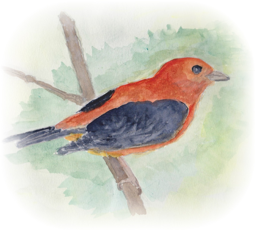

It’s been awhile since I saw one of these beautiful birds…lovely. (K)
LikeLiked by 1 person
Thank you. They are so bright and colorful! I wish I could have really captured that scarlet hue.
LikeLiked by 1 person
Nature is hard to duplicate!
LikeLiked by 1 person
Impossible, really, but she is certainly inspiring.
LikeLiked by 1 person
What a beautiful bird! Great shapes too, Judith!
LikeLiked by 1 person
Thank you, Laura.
LikeLiked by 1 person
This is lovely! You’ve captured him rather nicely I’d say 😀
LikeLiked by 1 person
Thank you so much!
LikeLiked by 1 person
Beautiful!
LikeLiked by 1 person
Thank you 🙂
LikeLike
Now you are my bird inspiration. I have not tried drawing and coloring birds yet. One day soon. Continue on inspiring!
LikeLiked by 1 person
Thank you. I’m so happy my little bird is inspiring you. I love birds. I’m glad I’m able to draw them a little better now. My earlier ones were really misshapen!
LikeLiked by 1 person
Hey little birdie! I think I hear you singing now!
LikeLiked by 1 person
🙂
LikeLike
What a lovely, delicate painting. I’ve never seen one of those before but I would love to. I can see why it would be inspirational.
LikeLiked by 1 person
They’re so colorful. My painting doesn’t do the bird justice.
LikeLiked by 1 person
nice and beautiful!!
LikeLiked by 1 person
Thank you 🙂
LikeLike
He IS BEAUTIFUL!!! Lovely job Judith!
LikeLiked by 1 person
Thanks! Oh, but you should have seen the real bird! His colors were so bright and brilliant.
LikeLiked by 2 people
AWESOME painting, Judith!! YAY!! 🎨💕👍
LikeLiked by 1 person
Thank you, Jill 🙂
LikeLike
Ohhhh yay! A scarlet tanager. Well done!
LikeLiked by 1 person
I wish I knew how to get the colors as bright as they were on the bird. He was so brilliant!
LikeLiked by 1 person
They are brilliant and you did a fine job!
LikeLiked by 1 person
Thanks.
LikeLike
Such a beautiful picture:)
LikeLiked by 1 person
Thank you!
LikeLiked by 1 person
You’re welcome, love the colours:)
LikeLiked by 1 person
🙂
LikeLike
He’s lovely! Very nicely done.
LikeLiked by 1 person
Thank you so much 🙂
LikeLiked by 1 person
I am a bird lover and we also have tanagers, I would have join you all but I have enough on my hands! I can’t wait to see what is next 🙂 your colors are bold by the way, definitely not wishy washy.
LikeLiked by 1 person
I tried to be bolder with the tanager, but the image still falls far short of how brilliant the bird’s colors truly were. I’m going to keep working on “boldness”. That’s becoming my new art mantra. 🙂
LikeLiked by 1 person
yep, boldness! that is my new mantra as well. 🙂
LikeLiked by 1 person
To boldly paint where no artist has painted before! 🙂
LikeLiked by 1 person
lol! yep!
LikeLiked by 1 person
This is gorgeous! And in my home state!! Love this one!! 😍
LikeLiked by 1 person
I didn’t realize you were from Missouri. Where about?
LikeLiked by 1 person
I’m in Kansas City! 😉
LikeLike
Oh, my. Well, I’m in Harrisonville. Small world!
LikeLiked by 1 person
Hey cool! You’re right down the street! well… about 45 minutes down the street. Hehe
LikeLiked by 1 person
Yeah, it’s a fairly long street 🙂
LikeLiked by 1 person
Great image Judith. I think you had a really nice light touch with this one, the different colors and values are nicely in balance in my opinion, and you kept the background in check so the focus is on the bird. I hope you had a good time doing this.
LikeLiked by 1 person
Thanks. I enjoyed painting the bird, but in the end I was a little disappointed that I couldn’t capture the brilliance of its colors. They’re so beautiful when you see them. Their red wings make such a startling contrast against the green fields of the countryside.
LikeLike
Your comment above was exactly what I was thinking, too, Judith. To make his wings stand out more, put him against a green (or greenish) background (maybe set him against some leaves, you could do another one this way). Green being the opposite (various shades of green, doesn’t have to be grass green necessarily) makes red stand out more.
But this bird is very delicate. There’s different kinds of feeling in art. Nice!
LikeLiked by 1 person
Thanks. I was concerned about getting the background too dark. I guess I went too far in the opposite direction. I have a lot of trouble painting backgrounds. Mine always look messy.
LikeLiked by 1 person
Your painting is fine, but if you want it to be ‘bolder’, I guess you can go a bit more opaque with the bird, then a light green wash for the background. I wouldn’t worry about this painting, though. It’s very light and the hues work quite well. I’d hand it on my wall with a simple, dark walnut frame. Nice work!
LikeLiked by 1 person
Thanks! I should have thought about using opaque watercolors. Duh…I have a set from Grumbacher that I won in their “mystery box” contest one week.
LikeLiked by 1 person
Go for it! There are plenty of ways to make more intense colors like ‘underpainting’ with color pencils and glazing/layering.
You’re lucky you got a set of Grumbachers from a mystery box. I only won once and it was a stub for a hotdog sandwich.
LikeLiked by 1 person
So many different techniques to learn 🙂 I guess my second year of art will be as adventurous as the first!
LikeLiked by 1 person
There’s no end to learning. I always tell myself, the day I stop learning new things about my craft is the day I’d rather stop doing it. On with the adventure! 🙂
LikeLiked by 1 person
Oh, at my live online class last night, we started on our ink wash project. We didn’t get too far, though. I hope we finish it up next week. We used a photo of a rocky shoreline as inspiration, but then spent almost the entire hour last night drawing in the rocks. The only wash we did was the sky and a bit of ocean.
LikeLike
That sounds like a fun class and I can tell you’re having a great time. I just bought myself a fresh bottle of India ink and I’m gonna try and do some washes over the weekend (that is, if I finish my animation shots tonight!)
LikeLiked by 1 person
Go finish your work so you’ll have time to play!
LikeLiked by 1 person
So glad to be included 🙂
LikeLike
Love the colors!
LikeLiked by 1 person
Thanks! Blue and orange have always been my favorite complements.
LikeLike