
When I did a few watercolor portraits a couple of years ago, I learned a clever little rhyme:
Red and yellow, brown and white
Help us get our skin tones right


Two Watercolor Portraits
That little rhyme did help me in creating skin tones, but I painted only a few portraits and moved on to other things.
Now, as I work on improving my oil painting, I’m interested in doing portraits, and getting accurate flesh tones is a necessary skill. Using red, yellow, brown, and white is a method that does work, but I’ve discovered another way of approaching skin tones.
Using red, yellow, brown, and white involves a bit of trial and error. It’s mostly a matter of guesswork. You start with mixing a very generic flesh color, then add more of this or more of that until you’ve got a tone that’s close to what you want.
The method I learned today, however, might prove easier and more useful, and maybe more accurate since I now have specific references for each different skin tone. This technique involves the use of complementary colors on the color wheel.
You remember the complements, I’m sure:
Red – Green
Yellow – Violet
Blue – Orange
Mixing each primary with a touch of complement, and then also mixing each secondary with a tiny bit of its complement produces six shades that can be used for flesh tones.
Starting at the top of my color wheel and moving clockwise, we have the following colors:
Mustard – Yellow with a bit of violet
Burnt Orange – Orange with a touch of blue
Brick Red – Red with a little green
Dull Violet – Violet with yellow
Umber – Blue with orange added
Dull Grayish Green – Green warmed with red
While none of these colors may sound much like a skin tone, the addition of a bit of white creates an amazing array of appropriate flesh tones.
Here is the skin tone color wheel I created as part of my morning art study:
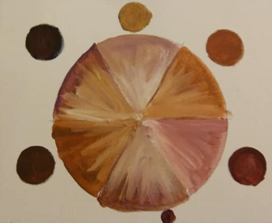
Although my painting here isn’t too neat, I think you can see how these color combinations actually do create a wide range of possible skin colors.
Why does this method work?
It works because every skin tone actually contains all three primary colors in varying ratios. Mixing complementary colors creates a blend of the three primaries.
Another good piece of information I found today is our skin color may be warmer or cooler, depending upon where it is! Thin skin — such as you’ll find at the temple — tends to appear cooler. Skin at the tip of the nose, on the cheeks, and on the forehead is usually warmer-looking.
Need to warm up your skin tone color? Add a bit more red or yellow. If you need to make the color slightly cooler, just mix in a bit more blue.
Of course, as with many other areas in art, the technique for creating proper skin tones can be a very personal thing with different artists creating their own recipes. A quick online search will turn up dozens of how-to articles on the topic of mixing flesh tones. So consider this method as just one more possibility.
About the only thing portrait artists tend to agree on is that buying ready-made flesh colors is not the way to go. As inexperienced as I am, I’m still quick to agree with that. Skin tones vary too much for a “one tube fits alls” approach, and truthfully, mixing just the right skin color is a lot of fun.
Now, I’m eager to do a bit of portrait painting and put this little practice exercise into actual practice.

interesting article, i alw3ays struggle w/ skintones
LikeLiked by 1 person
From the online research I did, it seems a lot of artists have questions about creating skin tones, so I thought sharing this approach might be helpful to others. I’m planning to do a portrait in the near future, and I’m going to use this method of creating the right skin tones.
LikeLike
When I used to work from recipes for skin tones, I would always find that my mixing results were very different from those of the person who made the recipes, Judith, unless I used the exact same brands of paint that they did. So my opinion is, if you give a color mixing recipe, you have to state the exact brand you used in order for someone else to replicate your results, otherwise color bias can be a big problem! Since then though, I have moved on to using mostly the palette of Anders Zorn as it is so awesomely intuitive, flexible and really simple (Cad Red, Ivory Black, Titanium White and Yellow Ochre) Best for fair skin, though.
LikeLiked by 1 person
I’m still new enough to portrait painting that I haven’t considered too many possibilities yet. I think it’s something that every artist has to play around with — not just mixing skin tones, but finding our own personal palette, our own preferences for various hues by different manufacturers, and our likes and dislikes for what to mix and what to buy already mixed. I definitely agree that color mixing recipes should be more specific, but I don’t think that’s ever going to happen because it’s such an intuitive process. I know even when I watch tutorials and instructors are mixing paint on the palette, I’m always wondering, well, exactly how much are you using? Color mixing is in itself an art, and it will require a lot more time and experience for me to become proficient at it.
LikeLiked by 1 person
Yes, there’s a whole lot of learning on this subject, for sure! Some might say a lifetimes worth! I would strongly advise you to take your own notes, as you experiment, and then you will always at least come close to replicating your successes and yes, measuring is an art, for sure and best expressed as a ratio so it can be scaled up if you are painting something big. I have a few books on the subject but, to be honest, most of the things I have learned that have been useful on this subject come from Will Kemp of willkempartschool.com – Happy Painting, Judith! Hope to hear more from you on this subject!
LikeLiked by 1 person
Oh, yes, note-taking is so important! I should do that more often. 🙂
LikeLiked by 1 person
Yes, I should do it more often myself!! 🙂
LikeLiked by 1 person
🙂
LikeLike
Interesting article, I’ve had a couple of successful skin tone mixes but no idea how I created them – so yeah, taking notes would’ve been a good idea.
I’m on watercolour so guessing it’s different again but 2020 will be the year that I get some opaque media in the art supplies so no doubt I’ll be creating all manner of mixes of mud.
LikeLiked by 1 person
I’m looking forward to trying more portraits this year, and it will be fun to play with different skin tones to use for highlights and shadowed areas. Yes, writing down our mixes could be helpful. I don’t think I’ve ever been able to mix the same color twice. (Another bad habit I have is not mixing enough paint at one time.)
LikeLiked by 1 person